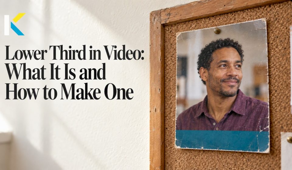

A lower third is a text title or graphic placed in the lower part of the video frame. It tells viewers who is speaking, where they are or what they are watching, without covering the action. Adobe describes it as an overlay that gives context without pulling attention from the frame. You can build one in any editor that has a text tool and a timeline, including an online one. Below you will find what to put in it, how to design it, how long to leave it on screen and how to add it step by step.
Key Takeaways
- A lower third is a short text overlay near the bottom of the frame, most often a person’s name and title, a location or a social handle.
- Keep it simple: one or two lines, a clear font, strong contrast and a safe margin from the edges.
- Show it just long enough to be read comfortably, then remove it. Longer videos can repeat it for people who join late.
- A basic fade or slide is enough. Fancy motion competes with the person on screen.
- Save your finished lower third as a template so every video in a series looks consistent.
Table of Contents
- What a lower third means
- What to put in a lower third
- How long a lower third should stay on screen
- What makes a lower third readable
- Animation: keep it gentle
- How to add a lower third in a video editor
- Lower thirds for events and highlight videos
- Our perspective
- Try it in Kudoflix
- Common mistakes to avoid
- FAQ
- Sources
What a lower third means
The name comes from the position. The graphic sits in the bottom area of the picture, where it is least likely to hide a face. According to Wikipedia’s entry on the term, it does not have to fill a whole third of the screen. It only has to live in the title-safe lower area.
You will hear other names for the same thing. In North America people also say chyron, super or caption, and in the UK a name strap or aston, as the same reference notes. On a small team, “name title” or “name tag” is common too.
A video without any of these graphics is called a clean feed or textless version. Producers keep one so that a distributor in another country can add text in its own language. If you plan to publish in several languages, export a clean copy before you add titles.

What to put in a lower third
The best lower thirds answer one question the viewer is already asking. Typical contents, per Adobe’s guide, are:
- A person’s name and title
- A location
- A social media handle
- A caption
Restream lists further uses: news, documentaries, sports, livestream questions or comments, calls to action and source citations.
One, two or three tiers
A tier is a line of text. IBM’s live video guide explains that a one-tier lower third carries one piece of information, while two-tier and three-tier versions add something more, such as a description below a name or a ticker.
For most home, school, club and small business videos, two tiers are the sweet spot:
| Tier | Example | Use it for |
|---|---|---|
| Line 1 | Maria Lopez | The name, in your larger or bolder type |
| Line 2 | Owner, Lopez Bakery | Role, relationship or place, in smaller type |
Ideas by type of video
- Family videos: “Grandpa Joe, Lake Tahoe, 1987” over an old clip. A name and a place turn a nice clip into a story.
- Small business promos: the owner’s name and role, then later a website or a call to action.
- Social clips: your handle in the first seconds, so people who find the clip elsewhere can find you.
- Lessons and training: the instructor’s name once, then a short label for each new topic.
- Clubs and associations: the member’s name, their role and the season or event.
- Photo slideshows: a short caption with a year or a place on a key photo. If you are building a milestone slideshow, our graduation slideshow checklist shows how to pace photos and text together.
When to skip it
Videomaker advises asking whether the information is necessary and whether it might distract viewers. In an intimate family video where everyone already knows who is who, a name on screen may add nothing. Use a lower third when it adds context, such as a name for a guest or a place for a trip, and leave it out when the shot speaks for itself.
How long a lower third should stay on screen
The short answer is long enough for one comfortable read, and no longer. A common rule of thumb in video tutorials is a few seconds for a name and title. One broadcast design guide says a lower third has about two seconds to do its job: the viewer glances down, takes in the information, and looks back at the picture. That reading moment is why the text has to be short.
A practical method:
- Read the text out loud at a relaxed pace.
- Add a beat for the animation in and a beat for the animation out.
- Play it back. If you can read it twice, it is probably too long. If you miss a word, it is too short.
Longer text, such as a quote or a source citation, needs more time, so shorten the text before you lengthen the clip. If you are streaming or recording a long session, you can bring the graphic back later. IBM notes that showing it again helps viewers who joined mid-stream.
What makes a lower third readable
Most bad lower thirds fail for the same reasons: too many words, low contrast, tiny type or a position too close to the edge. Here is the checklist.
Keep the design simple
TechSmith recommends simple, clean layouts, high-contrast colors and clear fonts, and avoiding too much text or graphics that distract from the video. A semi-transparent bar behind white text is a classic fix when the footage is busy.
Respect the safe area
Keep the graphic inside the title-safe area with space around the edges. TechSmith notes this helps prevent cropping on different screens. Restream adds that the exact position can vary with the footage, so move the graphic if a face or an important object sits low in the frame.
Stay consistent
Use the same font, colors and position in every video of a series. Restream lists consistent branding next to readable fonts and sufficient contrast as marks of a good lower third. A small logo or a brand color is enough.
Do not steal the show
IBM’s guidance is that a lower third should not be the star: viewers should be able to scan it quickly and then focus on the video again. If you notice the graphic more than the person, simplify it.
Quick check before you export
- Can you read it on a phone screen held at arm’s length?
- Is anything cut off at the edges?
- Does it cover a face, a product or a subtitle?
- Is every word needed?
Animation: keep it gentle
Templates make it easy to get started, and simple fade or slide animations can increase engagement without distracting viewers. That is the whole recipe. A bar that slides in from the left, holds, and fades out looks professional. Spinning, bouncing or flashing text looks dated and pulls the eye away from your subject.
Two habits help. First, give the animation in and out the same speed and style. Second, match the motion to your video’s mood: a calm fade for a memorial or a family tribute, a quicker slide for a sports recap or a social clip.
How to add a lower third in a video editor
The steps are almost the same in any editor. Desktop tools such as Adobe Premiere use the Essential Graphics panel: you browse templates, drag one onto the timeline and customize it. Camtasia offers drag-and-drop tools and pre-made templates, or you can build one from scratch.
The approach in an online editor like ours is the same, without installing anything:
- Add your clip to the timeline and find the moment the person appears or the place changes.
- Pick a text style or template from the effects, transitions and text library, or start from a video template that already has a title layout.
- Type the name on line one and the role or place on line two. Make line one bigger or bolder.
- Choose a font and color with strong contrast against the footage. Add a background bar if the picture is busy.
- Place it low and inside the margin. Leave space from the left and bottom edges.
- Set the length on the timeline, using the guidance above, and add a fade or a slide in and out.
- Play it back at full screen and on a phone-sized preview.
- Duplicate it for the next speaker instead of starting over, and change only the text.
Use a separate track
TechSmith suggests putting branding assets on separate timeline tracks so you can swap a logo or update a lower third without disturbing the core footage. The same habit works for any editor with multiple layers. Our timeline editor lets you stack text above the video so the footage stays untouched.
Lower thirds for events and highlight videos
Events are where lower thirds earn their keep: speakers, award winners, sponsors and venues all need names on screen, and you often have only a few hours to deliver. Pairing a ready-made title template with a fast workflow matters more than perfect design. A well-made event highlight video leans on quick, legible titles that identify people and moments without slowing the pace. For the editing side, see how we approach same-day event highlight editing with templates, or look at our conference video editor if you are cutting talks and panels.
A tip for multi-speaker footage: build one lower third, style it once, then copy it for each speaker. Everyone ends up with the same look, and you only change two lines of text.
Our perspective
Most people who search for a lower third do not want a lesson in broadcast design. They want their video to look finished, quickly, and without installing something heavy.
That is the idea behind Kudoflix. We built an online editor so that a name title, a caption or a place label is a few clicks, not an afternoon of tutorials. Our template library is designed so that the typography is already balanced. You change the words, adjust the color, and you are done.
We also believe consistency beats cleverness. Create one lower third that suits your family, club or business, save it as a template, and reuse it across every video. Your audience will start to recognize your style, and you will spend your time on the story rather than the settings.
Because the work happens in the cloud, it runs smoothly even on an older laptop. That matters for the grandparent assembling a travel video, the teacher preparing a lesson and the shop owner cutting a promo between customers.
Mandrixx
Try it in Kudoflix
You can start building lower thirds on our free plan. It costs $0 per month. If you want more assets and advanced features, the paid plans are Starter at $9.99 per month or $83.88 per year, and Pro at $12.99 per month or $119.88 per year. Not sure how it looks in practice? Browse examples made with Kudoflix first, and read how video templates save time on repeat projects.
Common mistakes to avoid
- Too much text. If it needs three lines, it is probably a caption or a subtitle, not a lower third.
- Thin fonts on busy footage. They disappear. Use a heavier weight or a background bar.
- Inconsistent styles. Changing fonts between speakers looks accidental.
- Hugging the edge. Some screens crop the frame, so keep your margin.
- Covering the subject. Raise or lower the graphic when someone’s chin, hands or a product sits where the text would go.
- Showing it too early or too late. Bring it in a moment after the person appears, not at the same instant, so the viewer can first register the face.
FAQ
What does “lower third” mean?
It is a graphic or line of text placed in the lower part of a video frame, usually to identify a person, a place or a topic. The name describes the position, not the exact size. It is also called a chyron, super or name strap, depending on the region.
How many lines should a lower third have?
Most have one or two. One line works for a name or location, and two lines fit a name plus a role or description. Three-tier versions exist for news and live shows that add a ticker or extra detail, but they are rarely needed in personal or small business videos.
Do I need After Effects to make a lower third?
No. Motion-graphics software gives you fine control, but a text tool with a background shape and a simple fade or slide covers almost every use. An online editor with title templates lets you build one in minutes and reuse it.
What makes a good lower third?
It is short, readable and consistent. Use clear fonts, high contrast, a safe margin from the edges and gentle animation. The viewer should be able to scan it quickly and go back to the video.
Can I reuse my lower third in other videos?
Yes. Style it once, then duplicate it or save it as a template and change only the text. This keeps a series of videos visually consistent and saves time on every new project.
Sources
- Lower third graphics | Adobe
- Lower third | Wikipedia
- Lower third (mobile edition) | Wikipedia
- What Is a Lower Third? | Restream Learn
- Creating Lower Thirds for Live Video | IBM
- Tips for Lower Third Titles | Videomaker
- How To Get Started with Video Lower Thirds | TechSmith
- How Do You Add Branding to Recorded Training Videos? | TechSmith
- What are lower thirds in video broadcasting? | KeepTheScore
- Event highlight videos | LemonLens
Recommended