

Yes, thumbnails materially influence whether learners click and how platforms surface your video. A course thumbnail is the single biggest lever on click-through rate before anyone watches a frame, and YouTube’s own guidance notes that custom thumbnails show up on the vast majority of its top-performing videos. Skip this design step and you’re leaving enrollments, watch time, and discoverability on the table. Kudoflix and similar tools now make fixing that a five-minute job, not a design-team project.
TL;DR:
- Custom thumbnails featuring a person’s face significantly increase click-through rates and influence YouTube’s algorithm to surface videos more widely.
- Including a human face, short high-contrast text, and outcome visuals in thumbnails leads to higher engagement, especially on mobile devices.
- Thumbnails must be designed at 1280×720 pixels with proper contrast and tested across devices to ensure clarity and honest content presentations.
- Conducting A/B testing on thumbnail designs by monitoring impressions, CTR, and retention helps identify the most effective visuals over time.
- Using templates from Kudoflix streamlines thumbnail production, enabling consistent, quick updates that can boost course enrollments and learner motivation.
Table of Contents
- Why Video Thumbnails Matter for eLearning: Evidence and Platform Logic
- Core Elements of an Effective eLearning Thumbnail
- Design, Accessibility, and Technical Specs to Check Before Publishing
- How to Test and Measure Which Thumbnails Actually Work
- Thumbnail Creation Workflow and Templates Educators Can Adopt
- Practical Thumbnail Creation with Kudoflix
- The Psychological Impact of Thumbnails on Learner Motivation
- Common Thumbnail Mistakes to Avoid in eLearning
- Examples of Effective Video Thumbnails on eLearning Platforms
- Design With Honesty, Not Just Attention
- Try a Thumbnail Template With Kudoflix
- Sources
- FAQ
Why Video Thumbnails Matter for eLearning: Evidence and Platform Logic
A thumbnail gets processed by the brain almost instantly, well before a viewer reads your title. Human vision prioritizes faces, contrast, and emotional cues over text, which is why a course thumbnail with a real person’s expression tends to outperform a generic slide screenshot. This isn’t a design opinion. It’s measurable behavior, and the data backing it is more specific than most eLearning creators realize.
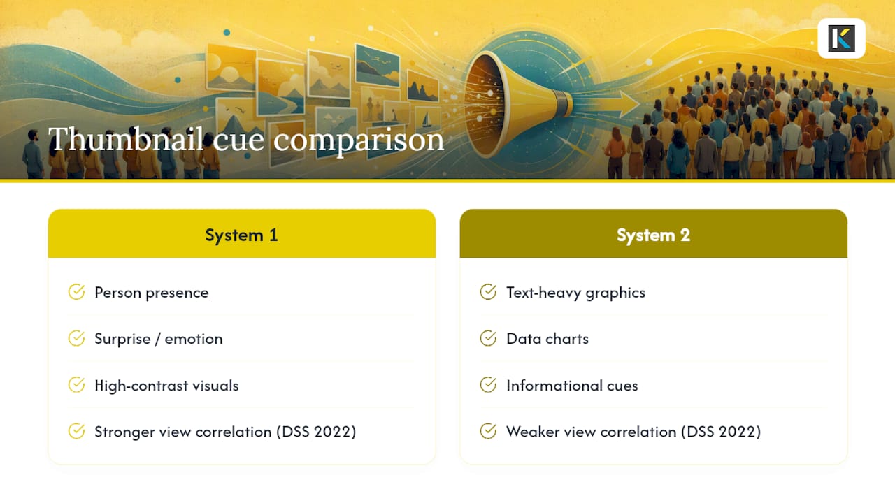
A 2022 study in Decision Support Systems analyzed the visual attributes of branded video thumbnails and found that “System 1” cues, the intuitive, emotional signals like a person’s face or a surprising visual, correlated more strongly with view-through rates than purely informational “System 2” elements like text-heavy graphics or data charts. That’s the core finding on thumbnail attributes and viewership, and it holds a clue for course creators: your brain reacts to a face before it reads a headline.
That pattern shows up again in education-specific research. An AI-evaluated analysis of 5,322 Excel tutorial thumbnails found that System 1 attributes, again surprise and person presence, correlated more strongly with view counts than purely descriptive design choices. The study’s Gradient Boosting model predicted viewership from visual features alone with notable accuracy, and its person presence detection was validated against human raters with high accuracy. In plain terms: for tutorial-style content nearly identical to what most course platforms host, having a person visible in the frame is one of the strongest single predictors of whether someone clicks.
Here’s the mechanism that makes this matter beyond vanity metrics. YouTube tracks click-through rate on Home and Suggested feeds in the first 24 hours as an early signal of quality, and it uses that signal to decide how widely to surface your video afterward. A weak thumbnail doesn’t just cost you a few clicks today. It tells the algorithm your content isn’t worth pushing tomorrow, which compounds against you for weeks.
A stat worth sitting with: custom thumbnails appear on a large majority of YouTube’s top-performing videos, according to the platform’s own thumbnail guidance. If your course library is still running on auto-generated frame grabs, you’re competing against a field that has already fixed this.
For course creators specifically, the consequences show up in enrollment numbers, not just view counts. Practitioner case studies collected by course-design resources describe one creator moving from 12 enrollments to over 200 after redesigning thumbnails around a face, a clear outcome statement, and consistent branding. Nothing else in the funnel changed. The lesson generalizes: your thumbnail is often the only marketing asset a prospective learner sees before deciding whether your module is worth their next ten minutes.
Core Elements of an Effective eLearning Thumbnail
Good thumbnails share a small set of repeatable elements, and each one earns its place for a specific behavioral reason.
A visible human face with genuine expression. Faces trigger faster recognition and more trust than illustrations or icons. The research on thumbnail attributes we covered above ties person presence directly to higher view-through, and for eLearning, a face also answers an unspoken question: who is teaching me this? An instructor’s face, even a small headshot crop, builds a sense of a real person behind the content rather than a faceless module number.
Short, legible text, three to six words at most. Anything longer collapses into an unreadable smear once the thumbnail shrinks to a mobile-sized card. Practitioner guides recommend capping thumbnail text around this range and using heavy, high-contrast fonts so the words survive compression and scaling. Think “Master Pivot Tables” instead of “Learn How to Build Advanced Pivot Tables in Excel.”
Outcome imagery that shows the payoff, not the process. A screenshot of a finished dashboard, a before/after comparison, or a visual of the skill in action communicates value faster than a slide titled “Module 3.” Learners click on outcomes, not agendas.
Consistent branding across your course catalog. A repeatable layout, logo position, and color palette make your library instantly recognizable in a crowded LMS or search results page, while still leaving room to vary the face, text, and outcome image per module. Consistency builds trust across a series; sameness without variation kills curiosity.
Simplicity built for a small canvas. One focal point, minimal background clutter, and a clear visual hierarchy matter more on a phone screen than on a desktop monitor, since most learners now browse course catalogs on mobile before they ever open a full player.
Here’s how those elements typically break down by priority:
- Face or instructor presence: builds trust and recognition instantly.
- Text under six words: readable at thumbnail size without a squint.
- Outcome visual: answers “what do I get” before the click.
- Branding elements: logo, color, and font kept consistent module to module.
- One clear focal point: no competing visual elements fighting for attention.
Pro Tip: Shoot two or three expressions when you record your instructor on camera, a neutral one, a surprised one, and a confident smile, so you have real options to test instead of relying on a single frame grab that happened to look decent.
A small observational study on thumbnail composition, drawing on user-generated content, found that emphasizing a single person, using two-line text headings, and placing the subject against a farther, less cluttered background correlated with higher views and likes. It’s a small sample, so treat it as a directional signal rather than a rule, but it lines up with the cognitive load argument: less visual noise means faster comprehension, and faster comprehension means more clicks.
Design, Accessibility, and Technical Specs to Check Before Publishing
Get the technical details wrong and none of your design choices matter, because the thumbnail either won’t render properly or won’t be legible where learners actually see it.
Export at 1280×720 pixels as your baseline resolution, saved as a JPG or PNG under 2MB. That’s the standard YouTube recommends, and most LMS platforms and course marketplaces default to the same aspect ratio for consistency across devices. Going lower resolution risks blur on retina displays; going much higher just bloats load times without adding visible quality.
Contrast is not optional. Text needs to hold up against its background at a glance, which usually means dark text on a light backdrop or a semi-transparent bar behind lighter text over a busy photo. This isn’t only a design preference, it’s an accessibility requirement: low-contrast thumbnails are harder to read for learners with visual impairments and harder to parse on a phone screen in bright sunlight.
Before you publish, run this checklist:
- Preview the thumbnail at true mobile size, not just zoomed in on your editing screen.
- Check file size and compression so it loads fast without visible artifacts.
- Confirm the thumbnail’s promise matches your title and your actual content, since a mismatch tanks retention even when it wins the click.
- Add descriptive alt text if your LMS supports it, especially when the thumbnail conveys information a screen reader user would otherwise miss.
- Test the image against both light and dark platform themes if your course catalog supports both.
A checklist-style guide from a course-design agency makes the same point from a different angle: testing at small sizes and across devices isn’t a nice-to-have step at the end, it’s the step that catches most real-world failures before a learner does. A thumbnail that looks sharp on your 27-inch monitor can turn into mud on a five-inch phone screen, and phones are where most course browsing now happens.
One more thing worth stating plainly: never let a thumbnail promise something the video doesn’t deliver. A dramatic “before/after” image for a module that barely covers the topic will win the click and lose the learner within the first minute, which drags down your watch time metrics and, over time, your discoverability too.
How to Test and Measure Which Thumbnails Actually Work
Stop guessing which design performs better with this Visual Content SEO Checklist for Digital Marketers to guide your testing and measurement. The data to settle the argument is sitting in your analytics dashboard already.
Track these four metrics whenever you evaluate a thumbnail change:
- Impressions. How often the thumbnail was shown to potential viewers, broken out by surface (Home, Suggested, search results), since each surface behaves differently.
- Click-through rate. The percentage of impressions that turned into a click, watched separately for Home/Suggested versus search, because a thumbnail that wins in search may lose in a recommendation feed.
- First-24-hour CTR. YouTube treats this early window as a key quality signal that shapes how widely your video gets pushed afterward.
- Watch time and early retention. A thumbnail that inflates clicks but tanks retention is a net loss, since platforms and LMS engagement scores both penalize high bounce right after the click.
For A/B testing, you have a few realistic options depending on your platform. YouTube’s built-in experiment tools let you run multiple thumbnail versions against live traffic. If your course lives inside an LMS without native testing, a simple controlled swap works too: publish version A for a fixed window, record impressions and CTR, swap to version B for an equal window, then compare.
Keep your sample honest. Platform guidance points to the first 24 to 72 hours as the critical observation window, and drawing conclusions from a few dozen impressions is a fast way to chase noise instead of signal. Give each version enough traffic and enough time before declaring a winner, and segment results by device where you can. A thumbnail that wins on desktop doesn’t always win on mobile, where cropping and scaling change what’s actually visible.
Smaller lifts are worth another testing round before you commit.
Thumbnail Creation Workflow and Templates Educators Can Adopt
Treat thumbnail production as part of your filming session, not an afterthought you scramble to handle after export.
- Capture options during the shoot. Record two or three instructor expressions and grab high-resolution stills of any outcome visual (a finished spreadsheet, a completed diagram, a final product shot) while you’re already set up. Retrofitting this later almost always means a lower-quality result.
- Build a repeatable template. Fix the face placement, the text zone, and the logo corner once, then reuse that layout across every module in a course. Consistency across a catalog helps learners recognize your content at a glance, even scrolling fast through a crowded list.
- Batch with variation. Use the same template skeleton for every video, but swap the expression, the outcome image, and the headline text per module so each thumbnail still earns its own click instead of blending into a wall of identical covers.
- Run a final QA pass. Check mobile legibility, confirm the file is compressed without visible quality loss, and verify title-to-thumbnail alignment before you hit publish.
Pro Tip: Build your template once in a project you can duplicate for every new module. Swapping the face, headline, and outcome image into an existing layout takes minutes and keeps your entire catalog visually consistent without redesigning from scratch each time.
Practical Thumbnail Creation with Kudoflix
Kudoflix’s template library maps directly onto the elements this guide covers: pre-built layouts with dedicated face zones, dynamic text boxes sized for readability at thumbnail scale, and export presets that hit the 1280×720 specification without manual resizing.
A workable micro workflow looks like this. Drop your instructor still or a frame pulled straight from your video into a Kudoflix template, swap in your outcome image, adjust the dynamic text to a punchy three-to-six-word headline, and export using the built-in web preset. No download, no separate image editor, no waiting on render queues.
Keep your variants organized in one project folder so you’re not hunting for the “before” version when a test finishes. Note your baseline CTR before you swap thumbnails, then check it again after 24 to 72 hours to see whether the new version actually moved the number.
Readers ready to build their own can start from the Kudoflix template library or browse the full editor feature set to see what fits a course catalog’s production pace.
The Psychological Impact of Thumbnails on Learner Motivation
A thumbnail does more than earn a click. It sets an expectation that shapes how a learner engages with everything that follows.
An outcome-focused thumbnail, one that shows the skill or result a module delivers, primes a learner to watch with a clear goal in mind. That framing effect matters for motivation: learners who understand what they’re about to gain tend to push through a dry introduction because they can see the payoff waiting on the other side. A vague or purely decorative thumbnail offers no such anchor, and attention drifts faster when there’s no concrete destination in sight.
There’s also a trust dimension tied directly to the emotional cues we covered earlier. A consistent, honest visual style across your course catalog builds a kind of implicit credibility. Learners start to associate your thumbnails with reliable content, which lowers the friction on every subsequent click. Break that pattern with an exaggerated or misleading thumbnail even once, and you introduce hesitation into every future decision a returning learner makes about your library.
The reverse also holds. Thumbnails that overpromise create a motivation cliff: a learner clicks expecting one thing, gets another, and disengages within the first minute. That drop doesn’t just cost the current session. It quietly erodes the sense of dependability that makes someone come back for module four after finishing module one.
Common Thumbnail Mistakes to Avoid in eLearning
The same handful of mistakes show up across course catalogs, and most of them are easy fixes once you know what to look for.
Relying on an auto-generated frame grab. Platforms will pull a random still from your video if you don’t upload a custom one, and that still is rarely your best frame. It’s the single easiest fix on this entire list, and it’s still the most common failure in course libraries.
Cramming in too much text. A thumbnail with a full sentence reads as noise at mobile size. Cut it down to a short phrase and let your title carry the rest of the message.
Mismatching the promise and the content. A dramatic thumbnail for a routine lecture wins the click and loses the trust, and that mismatch shows up in your retention data within the first few minutes of watch time.
Skipping the mobile preview. A thumbnail that looks great full-size on your editing screen can turn illegible once shrunk to a phone-sized card in a scrolling feed.
Letting branding override individuality. Locking every thumbnail into an identical template with no variation in expression or outcome image makes an entire catalog blur together, and blur doesn’t get clicked.
Never testing or revisiting. A thumbnail that performed fine a year ago might be actively holding back a course today. Platforms and course-design guides alike recommend refreshing older thumbnails periodically to see whether a new design re-attracts interest.
Examples of Effective Video Thumbnails on eLearning Platforms
The strongest course thumbnails share a visible pattern once you start looking for it across platforms.
A software tutorial thumbnail that shows the instructor’s face in one corner, a clean screenshot of the finished result in the frame’s center, and three words of bold text (“Master Pivot Tables”) consistently outperforms a plain slide title, matching the person-presence findings covered earlier in this guide.
A language-learning module thumbnail built around a split-screen “before and after” conversation snippet, paired with a flag or cultural icon for quick recognition, signals outcome and context in a single glance without needing any text at all.
A business-skills course thumbnail using a consistent color band across every module, with the instructor’s expression and a one-line outcome statement swapped per lesson, keeps a full catalog visually unified while still giving each individual video its own reason to earn a click.
What ties these examples together isn’t a specific color palette or font choice. It’s the discipline of showing a person, showing an outcome, and keeping text short enough to read in half a second, the same three principles this entire guide keeps circling back to.
Design With Honesty, Not Just Attention
The instinct to chase clicks is understandable, but clickbait thumbnails quietly sabotage the metric that actually matters for a course: completion. A misleading thumbnail wins a click and loses a learner within minutes, and that pattern repeats across your catalog until your retention data tells the real story.
Design for the promise you can actually keep. Measure completion alongside CTR, not instead of it, and treat a thumbnail as a contract with your learner rather than a lure. Consistency and accuracy build the kind of trust that brings someone back for module two.
— Mandrixx
Try a Thumbnail Template With Kudoflix
Kudoflix skips the software installation and the steep learning curve that make traditional editing tools such a slog for course creators without a design background. Templates are already built for the face, text, and outcome-image layout this guide recommends, and export presets handle the 1280×720 sizing automatically, so you’re not fighting resolution settings between recording a lesson and publishing it.
Start with the free plan to test a template against your current thumbnail, or move straight to a paid tier (Starter at $9.99 per month or Pro at $12.99 per month) if you’re managing a full course catalog and need the extended template library. Publish your redesigned thumbnail, then check your CTR after 24 to 72 hours to see the difference for yourself.
FAQ
What is the purpose of a video thumbnail?
A thumbnail is the visual preview that represents your video before anyone clicks. Its job is to earn attention and set an accurate expectation for the content, which directly shapes click-through rate and, on platforms like YouTube, how widely the video gets recommended afterward.
What is the YouTube 7-second rule?
There’s no official rule published by YouTube about a specific short time frame. What the platform does document is the importance of the first 24 hours of CTR on Home and Suggested feeds as an early quality signal, so treat any such claims you see elsewhere as informal advice rather than confirmed platform policy.
What are the drawbacks of using video for learning?
Video can encourage passive watching over active engagement, and poorly designed thumbnails or mismatched titles can set the wrong expectation and hurt completion rates. Pairing video with clear outcome framing and honest thumbnails, rather than clickbait, helps offset that risk.
What is the 8-minute rule on YouTube?
This typically refers to a historical time threshold that unlocked mid-roll ad placement eligibility for creators, not a rule about thumbnails or learner engagement. It’s a monetization detail, and it doesn’t affect how thumbnails influence CTR or discoverability.
Can Kudoflix help me design and test eLearning thumbnails?
Yes. Kudoflix offers templates built around face placement, short readable text, and outcome imagery, with export presets sized for standard thumbnail specs, making it practical for educators to design and swap variants without a separate design tool.
Recommended

